-
Tasks
-
Add favicon & update home title
-

-
Add umami analytics
-
Create more readable default order for dev blog
-

-
-
Had been wanting to revamp the site for a while - I really liked the UX of Andy Matuschak's notes & wanted to do something similar. Spent 2 hours this morning building out the layout template & transferring things over. The behaviour itself is 40 lines of js
-
function applyLinkOpenerBehavior(div) { var links = div.querySelectorAll('a'); links.forEach(function(link) { link.addEventListener('click', function() { var href = this.getAttribute('href'); fetch(href) .then(response => response.text()) .then(data => { const parser = new DOMParser(); const doc = parser.parseFromString(data, 'text/html'); const primary = doc.getElementById('primary').innerHTML; const currentContentColumn = this.closest('.ui-content-column'); const contentColumns = document.querySelectorAll('.ui-content-column'); contentColumns.forEach(function(contentColumn) { // only remove if not the current content column if (contentColumn !== currentContentColumn) { contentColumn.remove(); } }); // create a new div with a class of .ui-content-column var newDiv = document.createElement('div'); newDiv.classList.add('ui-content-column'); // put the content of the #primary div inside the new div newDiv.innerHTML = primary; // append the new div to the #main-scroller div var mainScroller = document.getElementById('main-scroller'); mainScroller.appendChild(newDiv); applyLinkOpenerBehavior(newDiv); }); // prevent the default action of the link // add the current url in the url bar window.history.pushState({}, '', href); event.preventDefault(); }); }); } -
Implement horizontal layout
-

-
It's kind of crazy that it's been nearly a year since last doing a batch of work on this - not sure where the time has gone. My learnings in the past year:
-
On Behaviours
-
Opening up Clerk on a regular basis just never became a habit that stuck. I would leave it unopened for months and then open it when I was having anxiety around money or wondering where my spending was going. I definitely personally have avoidance issues around money, but I'm guessing this is also true for most people.
-
At some point I wanted to do some research for business expenses and I threw my raw revolut export into a google sheet. This behaviour persisted much more than opening up Clerk - I think the combination of G sheets being familiar, and the amount of control that comes from a spreadsheet, had more of a draw.
-
Over time I got really sophisticated with the spreadsheet, eventually landing on a formula based approach that almost mimicked the Clerk UI. I had all of my categories listed in the first sheet and then a category column in the transactions spreadsheet that pulled them in dynamically, and a table that shows category breakdowns over time.
-
-
On Features
-
Despite doing reasonably well this year, there were still multiple months where I dipped into my savings before the month is out. I really regret this and wish I'd have been more controlled/intentional around that. My problem really stemmed from making poor decisions at the beginning of the month and accumulating more spend that I should have.
-
That said, I still haven't found a system simple enough to give me a no brainer answer to "Should I make this purchase". The ideal would be some set of the following:
-
When salary gets paid, subtract fixed and recurring costs to get the total amount of discretionary spend available for the month. Then divide this by the amount of days in the month and show a "You have $X per day". Then as the month progresses show some indicator as to whether you're adhering to that or going over. Then you can make decisions about purchases based on how much you've gone over or under your baseline per day.
-
-
Tying this Together
-
What I'm now thinking about is Clerk the app being a companion to a Google Sheet.
-
The sheet could either be given away for free or sold as a one time payment. There's enough value in the sheet itself to exist separately to the app. And we could do up a little help center and set of videos on how to use it.
-
Continuous Sync: No need to export as csv and import into G sheets which is a pain
-
Auto Categorization: Currently you have to go through and manually assign every transaction. This would be trivial with an AI API.
-
Multi currency normalization: Bank exports don't always offer a unified currency column, so totals can be massively wrong because they're adding, for example, Yen amounts alongside Euro amounts.
-
Backups & Rollback: The big downside of a g sheet is that it's easy to break. Giving users the ability to rollback in case they break something by accident could be super valuable.
-
-
-
Thinking:
-
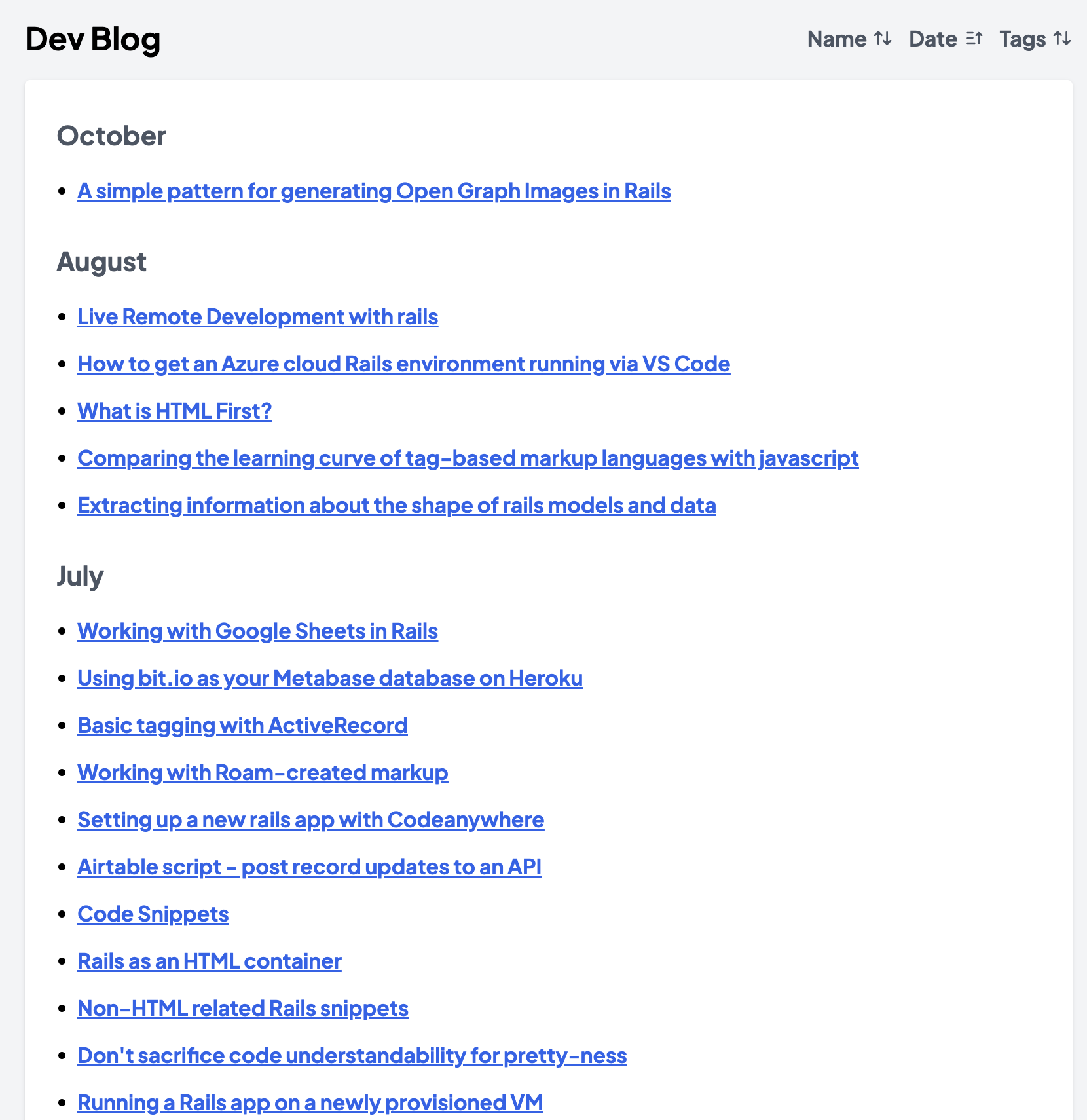
At some point I should combine Blog & Dev Blog - currently the posts on Blog are pretty out of date. On the other hand I could also just hide the dates altogether - I kind of loathe the idea that a significant amount of the implied value of a post comes from its recency. At the same time, people don't want to see a flat list of posts as it's just a wall of text.
-
Idea: What if I break down the posts by month, but remove the year. So posts from March 24 would show alongside posts from March 22.
-
Update profile photo
-
Clean up/remove some old posts
-
Hide year on posts index page
-
-
-
Re-write homepage
-
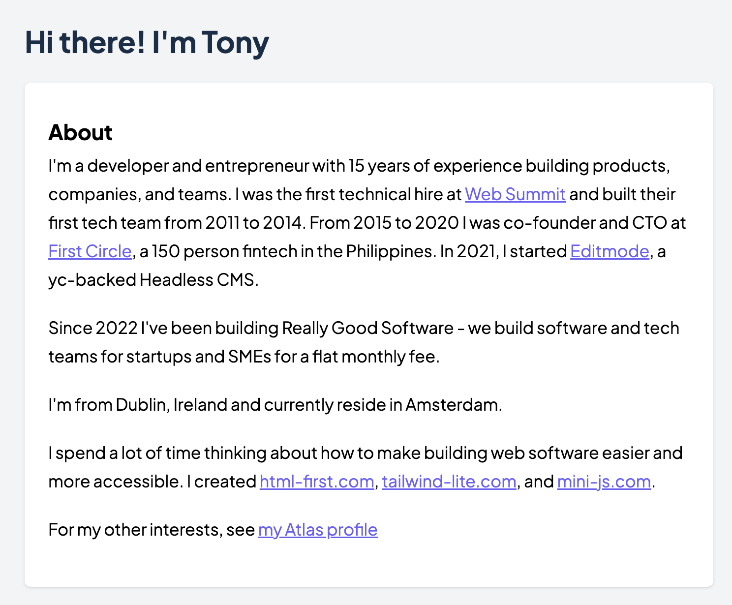
The old copy was out of date and to be honest felt a little too whimsical. So I updated it to something a little more professional
-
-
-
Work on improved design
-
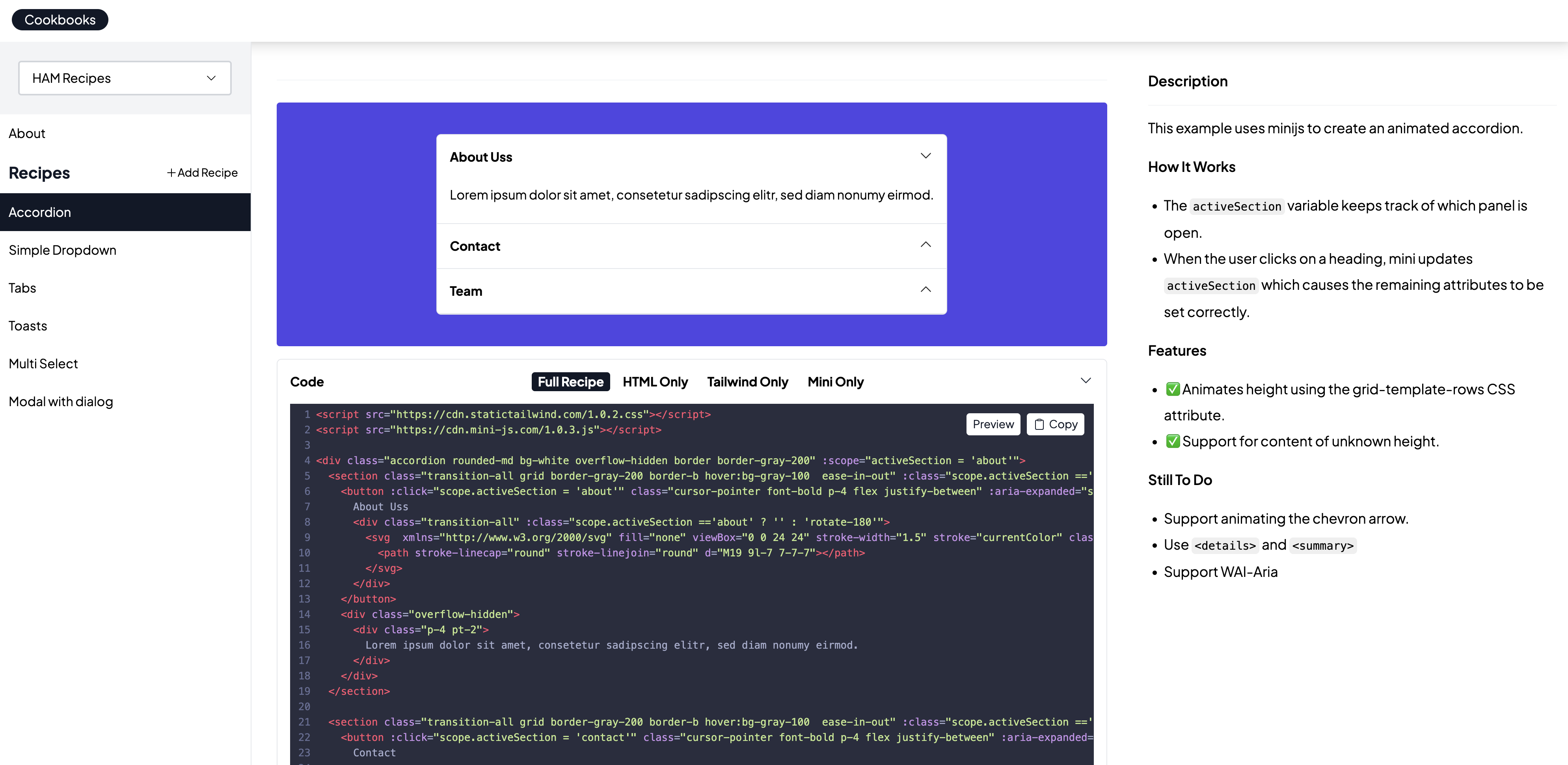
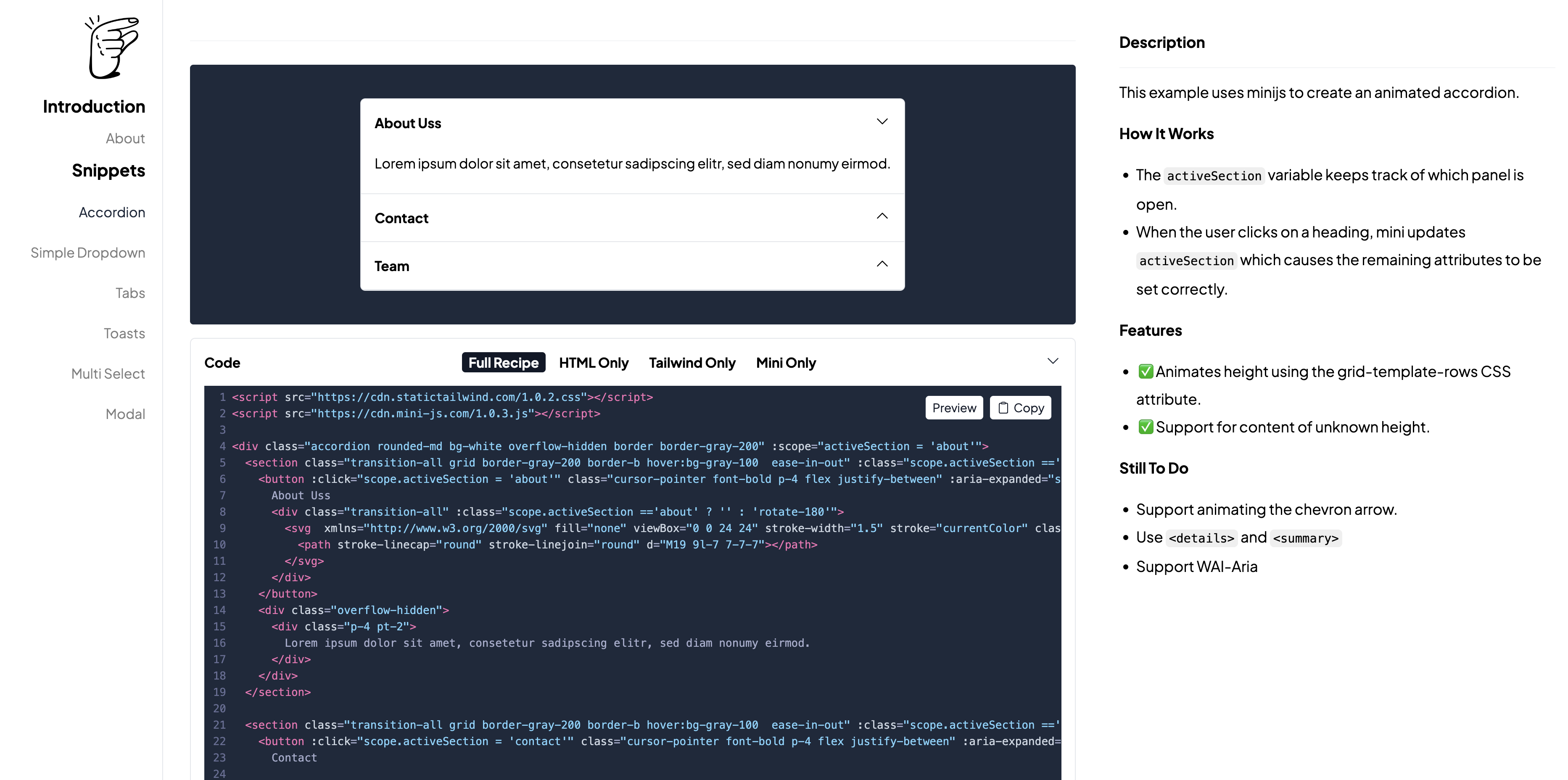
Took inspiration from Kamran's driver.js & copied colors/code highlighting from Tailwind. Pretty happy with the new look
-
Before
-
-
After
-
-
-
Set up cdn.mini-js.com
-
This took a little more effort than planned. I wrote it up here
-
-
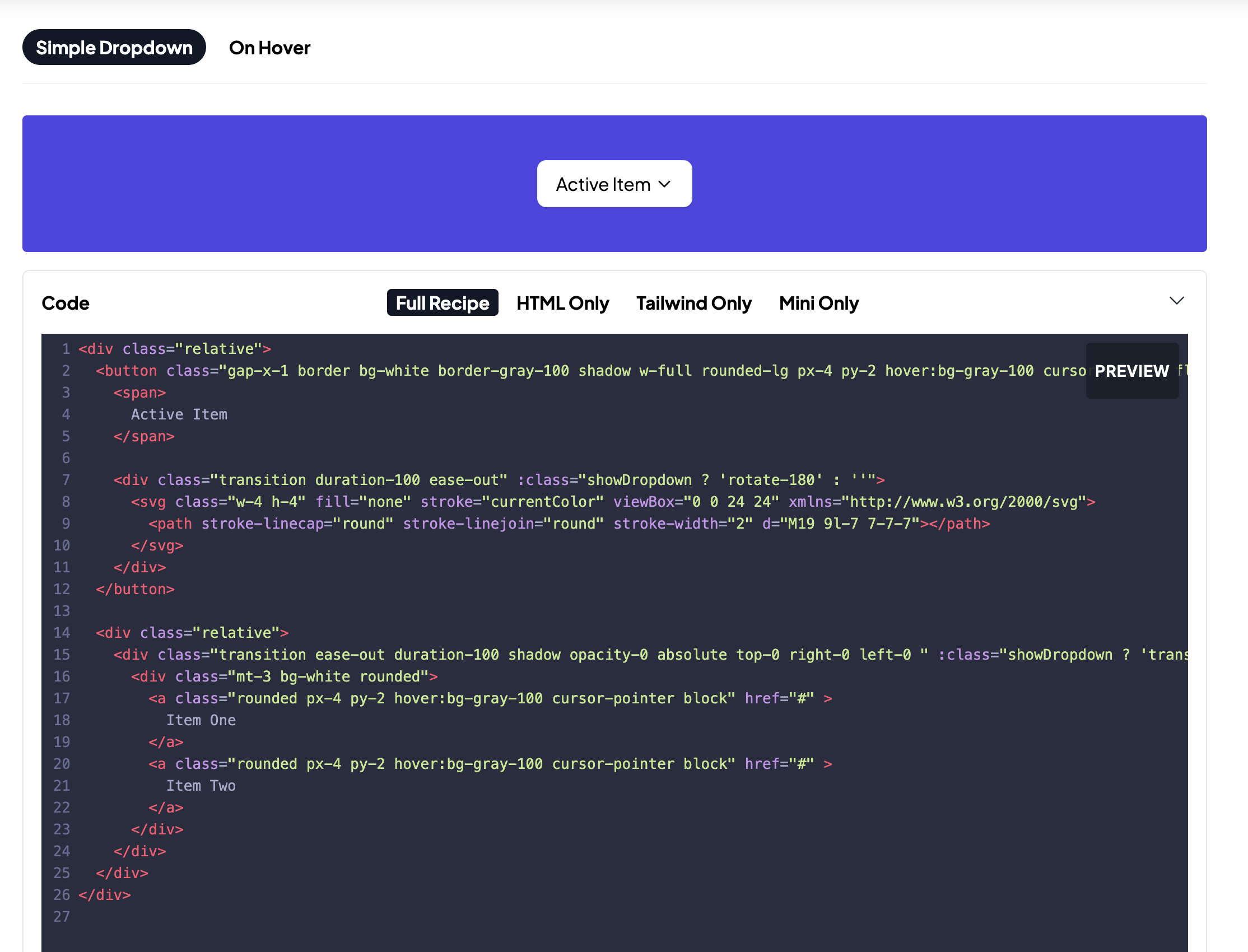
Add tabs to view code snippet in more readable way
-
Built this on the plane - you can now see a "cleaner" version of a snippet, (to aid comprehension) when you're working on it.
-
-
-
Add font back in for Recipes section
-
Tweak dropdown style
-
Feedback to Joey on
:clickme -
Thinking about Dark mode
-
I've personally never bothered much with dark mode, but it seems to be something people care about a lot. So it would be good to support it. The best way to do this, I think, is with Tailwind's
dark:modifiers. But I'll need to look into how and what to include in Static Tailwind. Which leads me to
-
-
Thinking about additional lists in the Cookbook
-
For each of the snippets we have, each is composed of three or four underlying patterns that can also be reused and remixed. I'd like to be able to have those patterns explained somewhere else, so that one could first read a "cheat sheet" which has things like: How to make a chevron arrow animate when hovered with tailwind. Then someone could skim through that list first and have more familiarity when reading the recipes section.
-
-
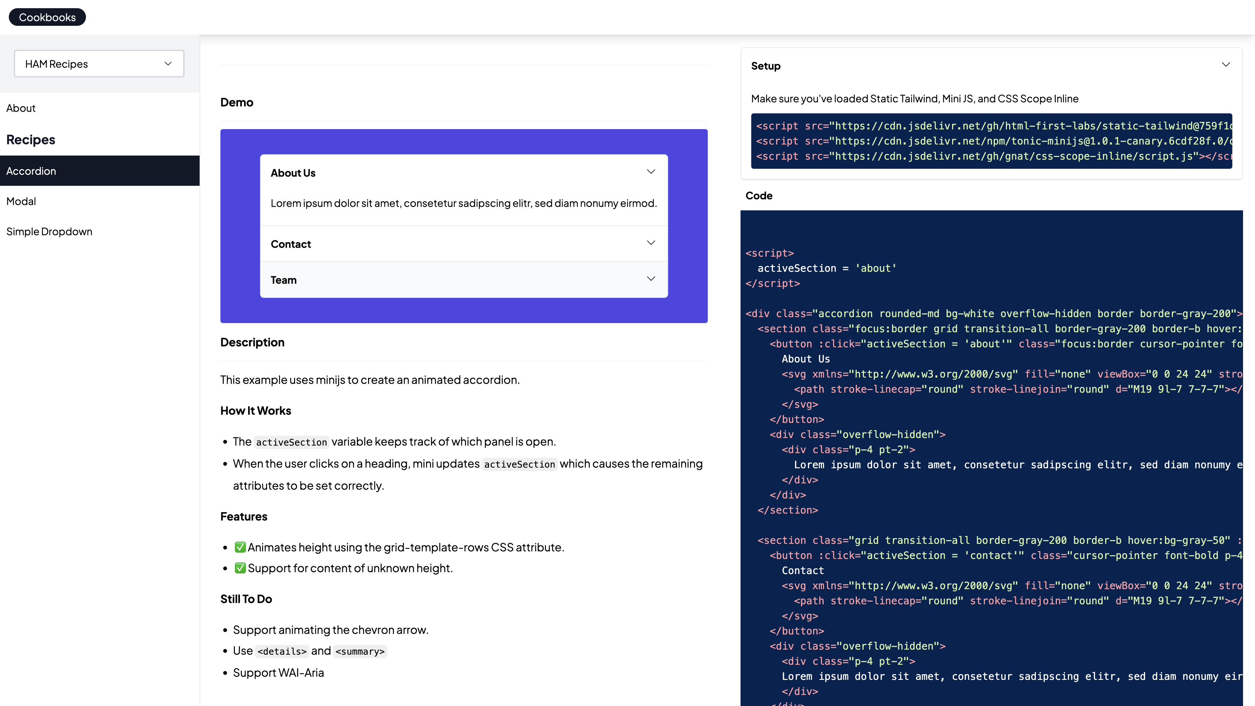
Evolve the Snippet frontend
-
-
Add support for podcasts
-

-
Tasks
-
Bug: Filtering seems to be broken on creator pages
-
Bug: Content type buttons hidden on mobile when topic is selected
-
Before
-

-
After
-

-
-
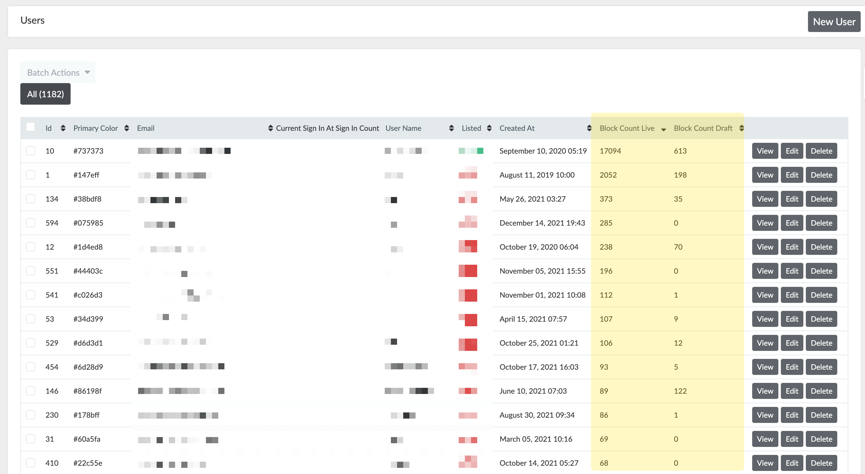
Add block_count counter to users (to see most active users)
-
-
-
Get app working again on letterboxgame.com
-
This took a few evenings because 1. The codebase is super old and several libraries need to be updated, and 2. I didn't want to lose the historical game data which is 2.65gb. But it's now back up and working at letterboxgame.com
-
Upgrade codebase to rails 7, ruby 3
-
Replace actioncable with ably
-
Get app running on main VM
-
Export database from old DigitalOcean droplet
-
Import database into new database
-
Reset sequences
-
-
Tasks
-
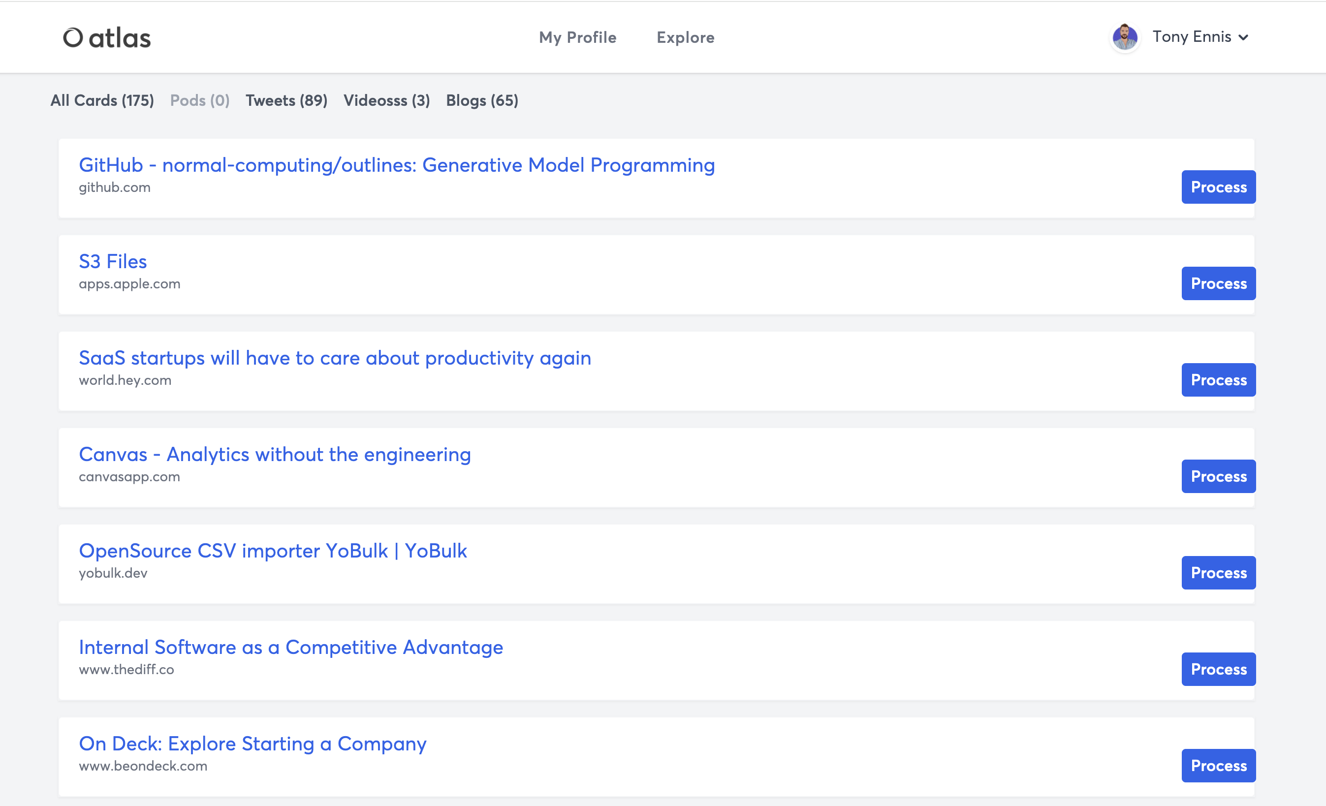
Fix the Queue
-
Before
-
-
After
-

-
-
Remove n+1 query for creator show page
-
Remove crisp chat if in mobile app
-
Fix active styling on top bar
-
Prevent page from breaking if topics or creator are missing
-
Fix creator index grid display on medium screen sizes
-
Review new app build
-
-
Chat to Alex
-
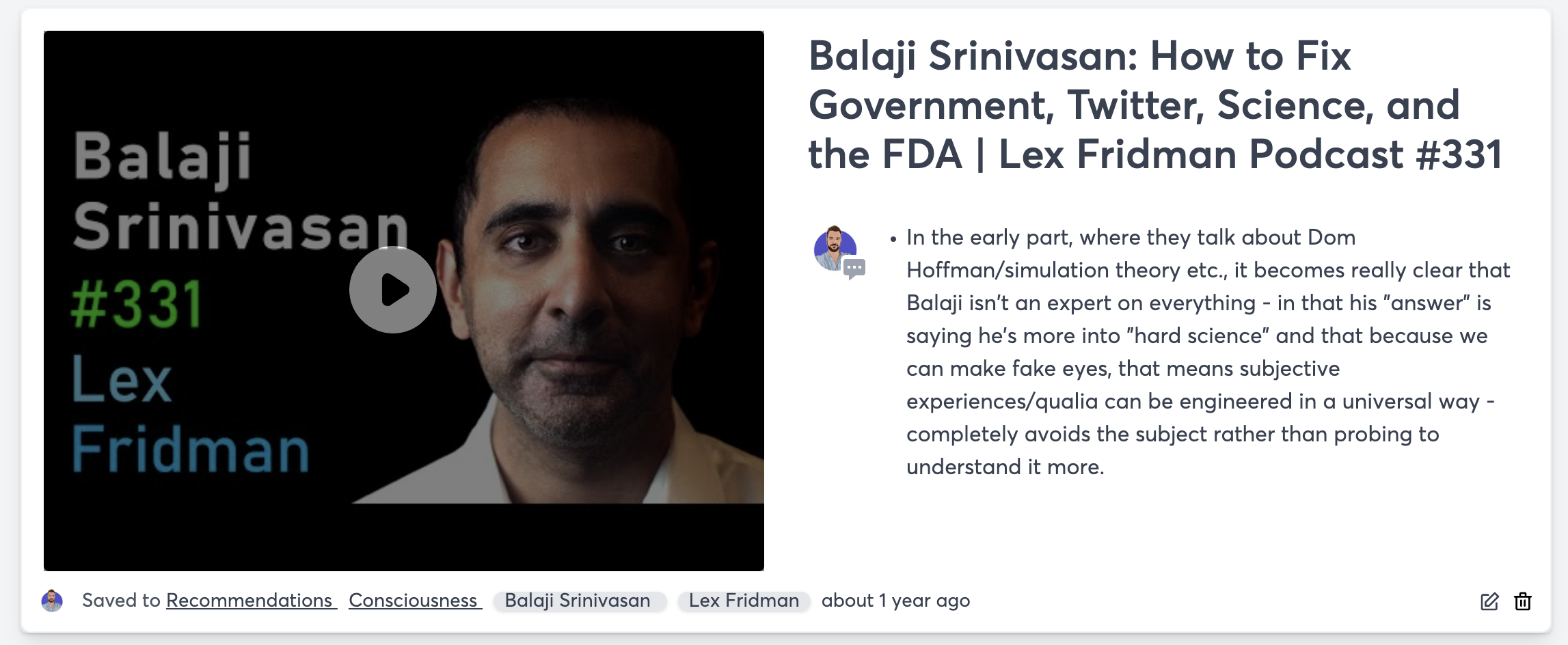
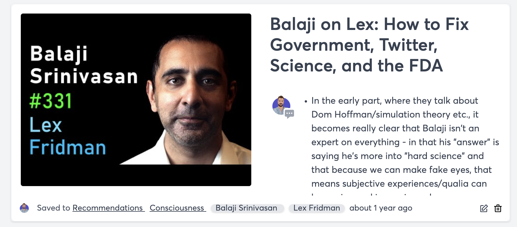
Improve display of youtube videos (make narrower)
-
Before
-
-
After
-
-
-
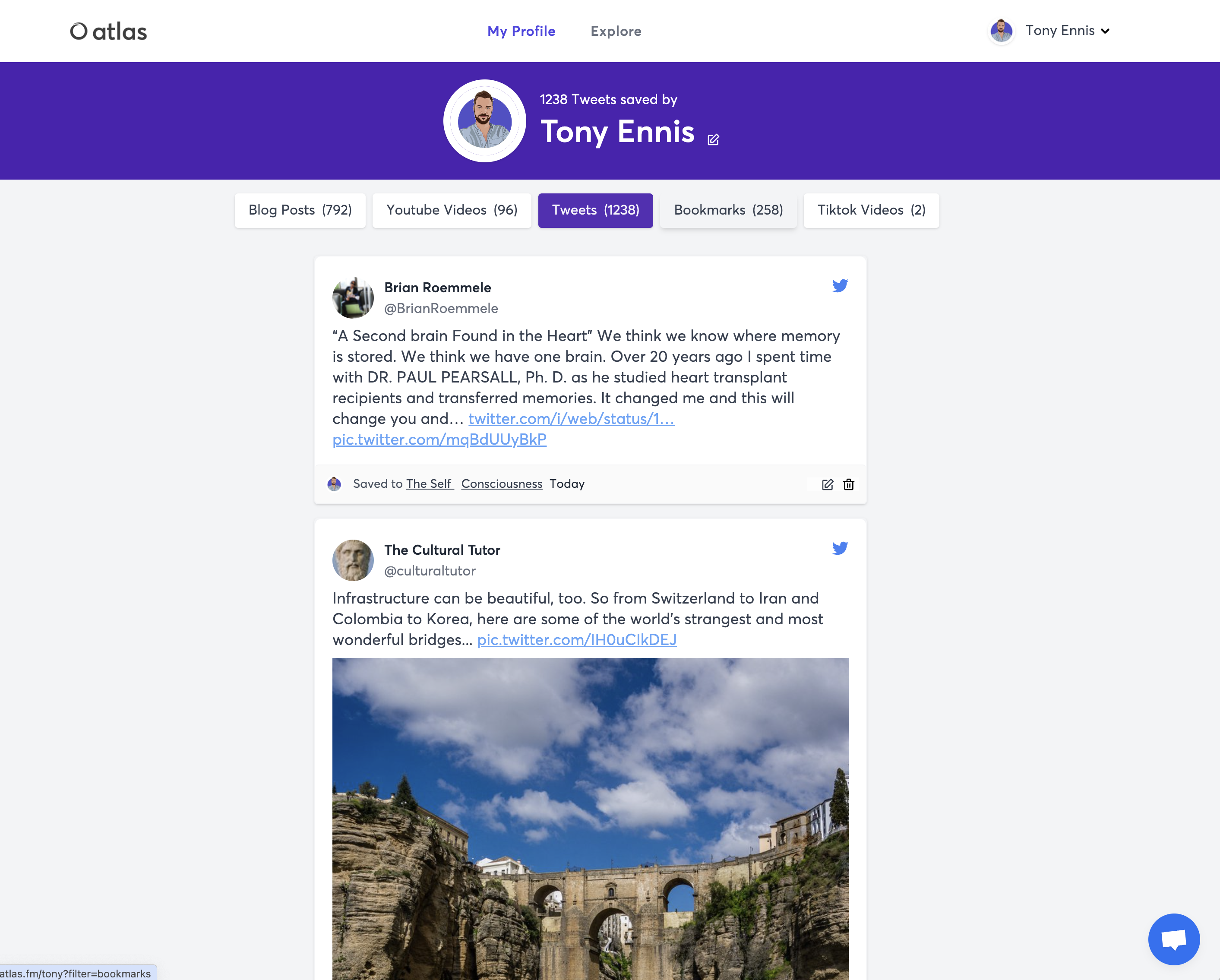
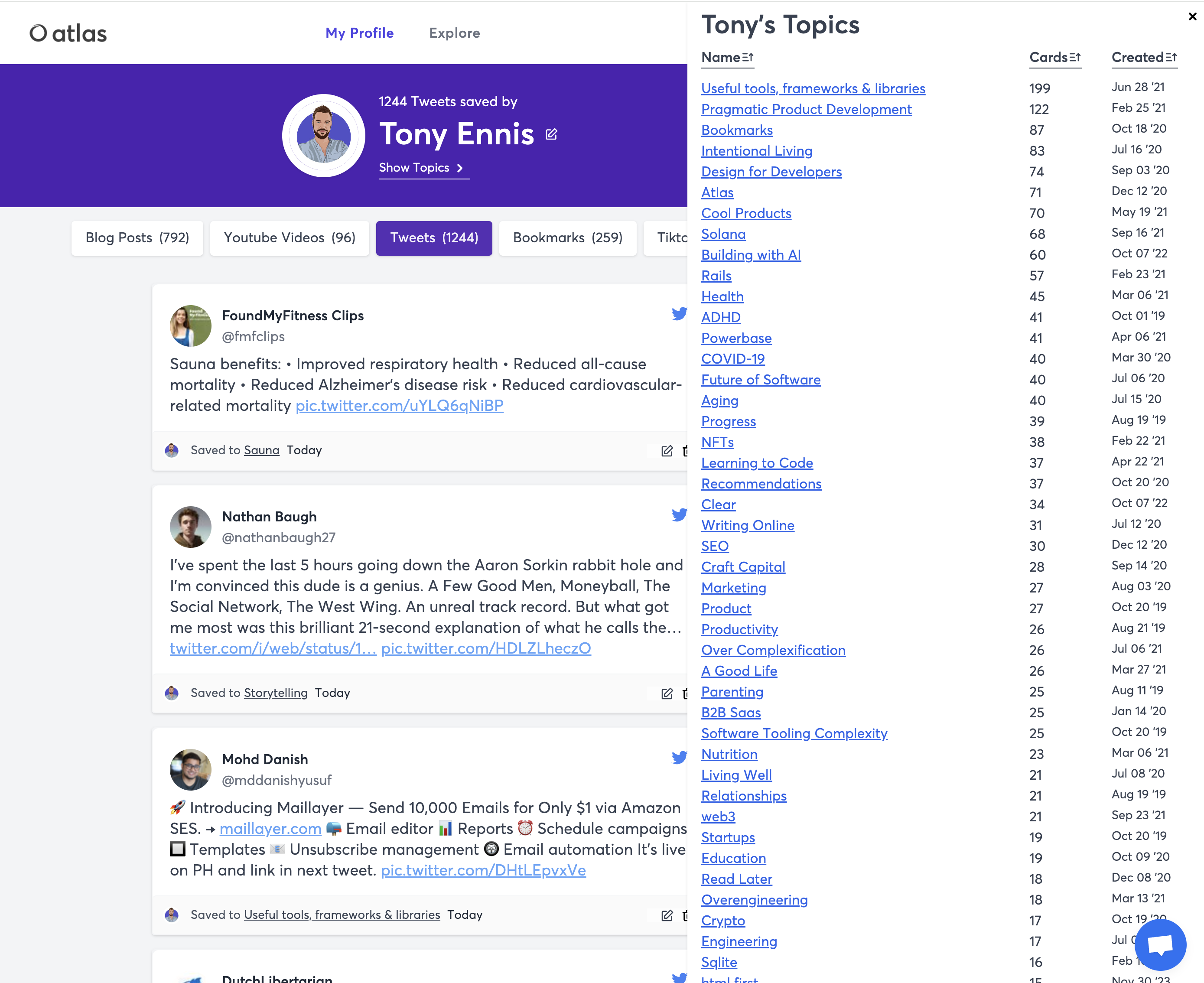
Add Topic browser drawer
-
Before
-
-
After
-
-
-
Polish block type nav on mobile
-
Before
-
-
After
-
-
-
Fix twitter avatar issue
-
Run script to retrospectively fix last 8 tweets
-
Clear cache
-
-
Fix Tiktok video issue
-
This was a problem with Cloudflare's Rocket Loader, which is why it was only happening on production. I just disabled Rocket loader for now.
-
-
Tasks
-
Deploy check username endpoint
-
Add avatar to user create endpoint
-
-
Webflow site updates
-
Remove video
-
Remove Blog Section
-
Remove testimonials
-
Update header fonts
-
Improve header copy
-
Remove Editmode
-
Remove "Made in Webflow" branding
-
Fix padding & alignment on features section & downloads section
-
Extension links
-
Chrome - update link
-
Safari - remove temporarily
-
iOS app - remove temporarily
-
-
-
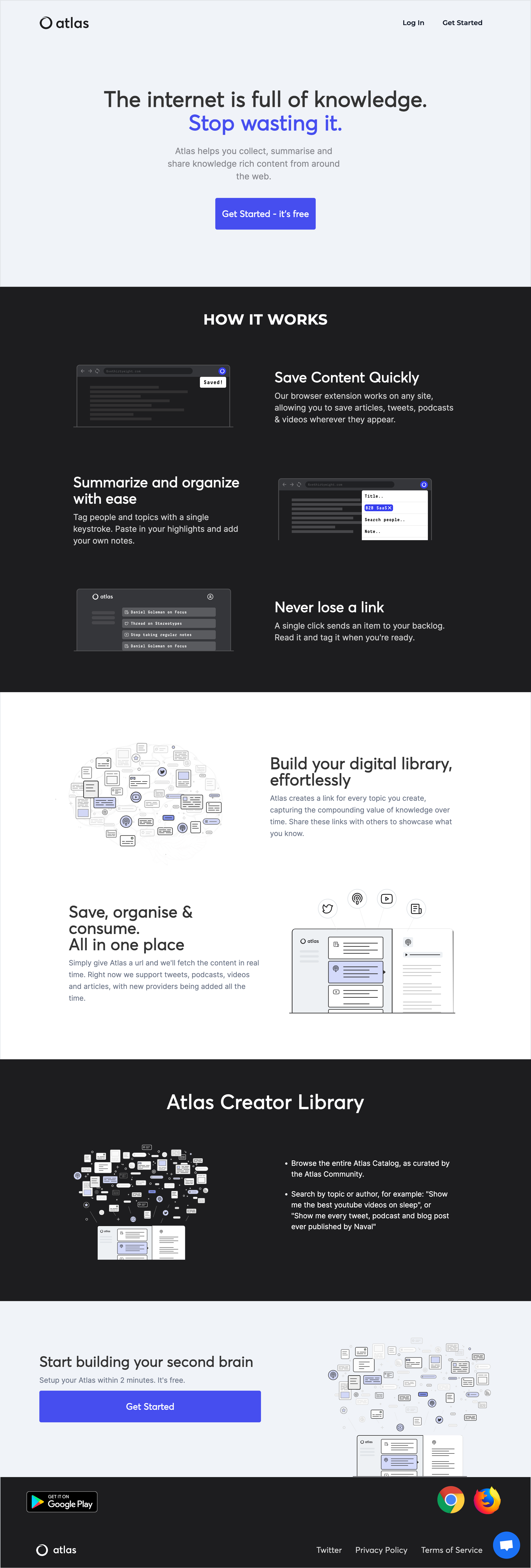
We still need a new website, but at least the current on doesn't have broken links and display issues for now
-
Screenshot with new updates
-
-
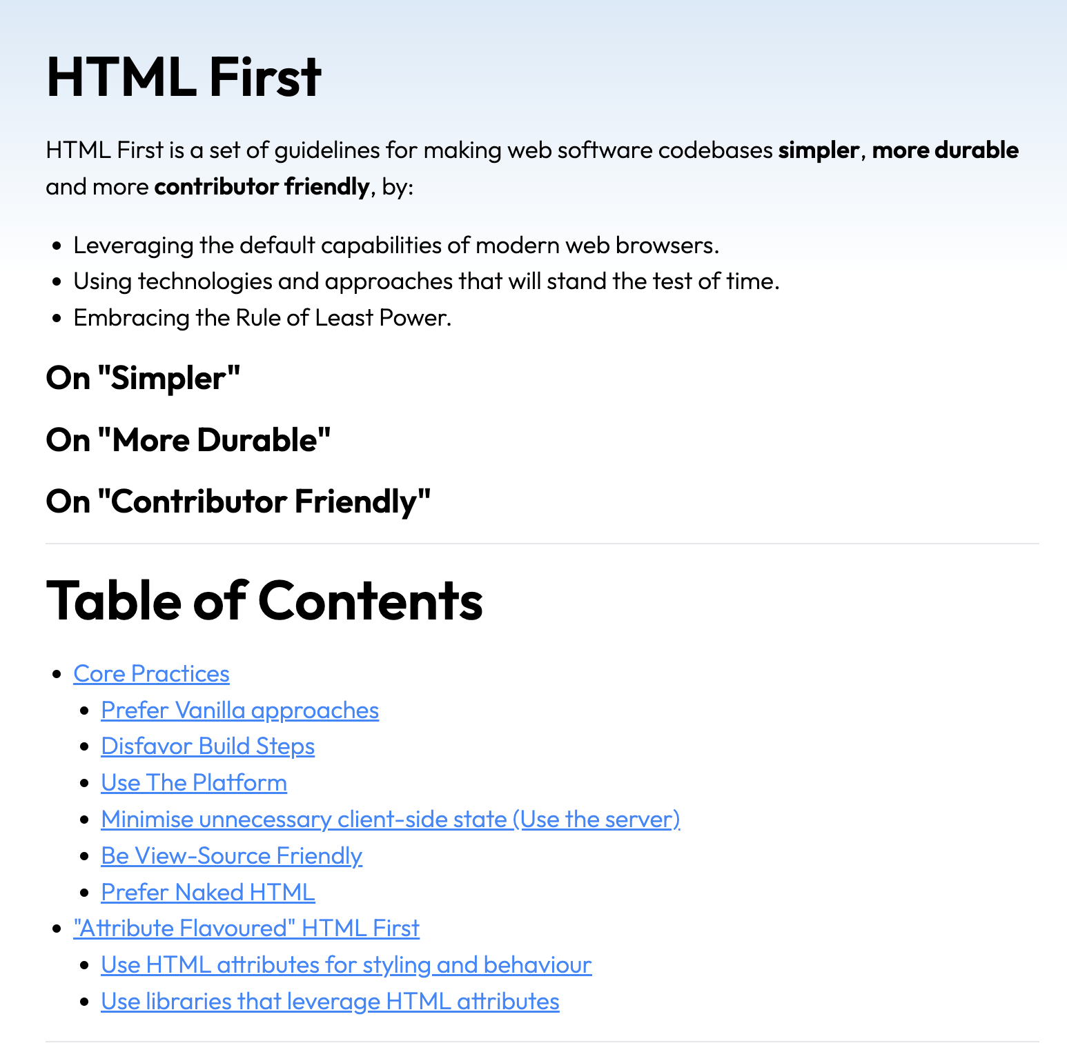
Have spent about an hour a day for the last few days jotting down more ideas for where I should take v2, including writing, then removing, new sections. I was second guessing myself a bit, but as of today's session I'm quite happy with this new direction. It retains the idea of being designed for contributors, without focussing too much on "let more people become programmers", which I don't think resonated in v1.
-
It also removes the subjective bits which drew a lot of objections - "easier, faster, more maintainable", and separates out the attribute-based stuff, which was also quite radical and likely unnecessarily alienated people.
-
At the same time I think it remains true to the original ideas I was attempting to capture, which was what I had been grappling with in the last few days. So overall I'm happy.
-
I still need to write descriptions for 5 sections - will try to do that during the next few days and/or on the plane home on Tuesday. Screenshots below of the before and after.
-
Before
-
-
After
-
-
Improvents on mobile projects page
-
Prevent images from spilling off the page
-
Remove the left date column
-
Still to do: Improve display of long completed tasks, improve display of projects table
-
-
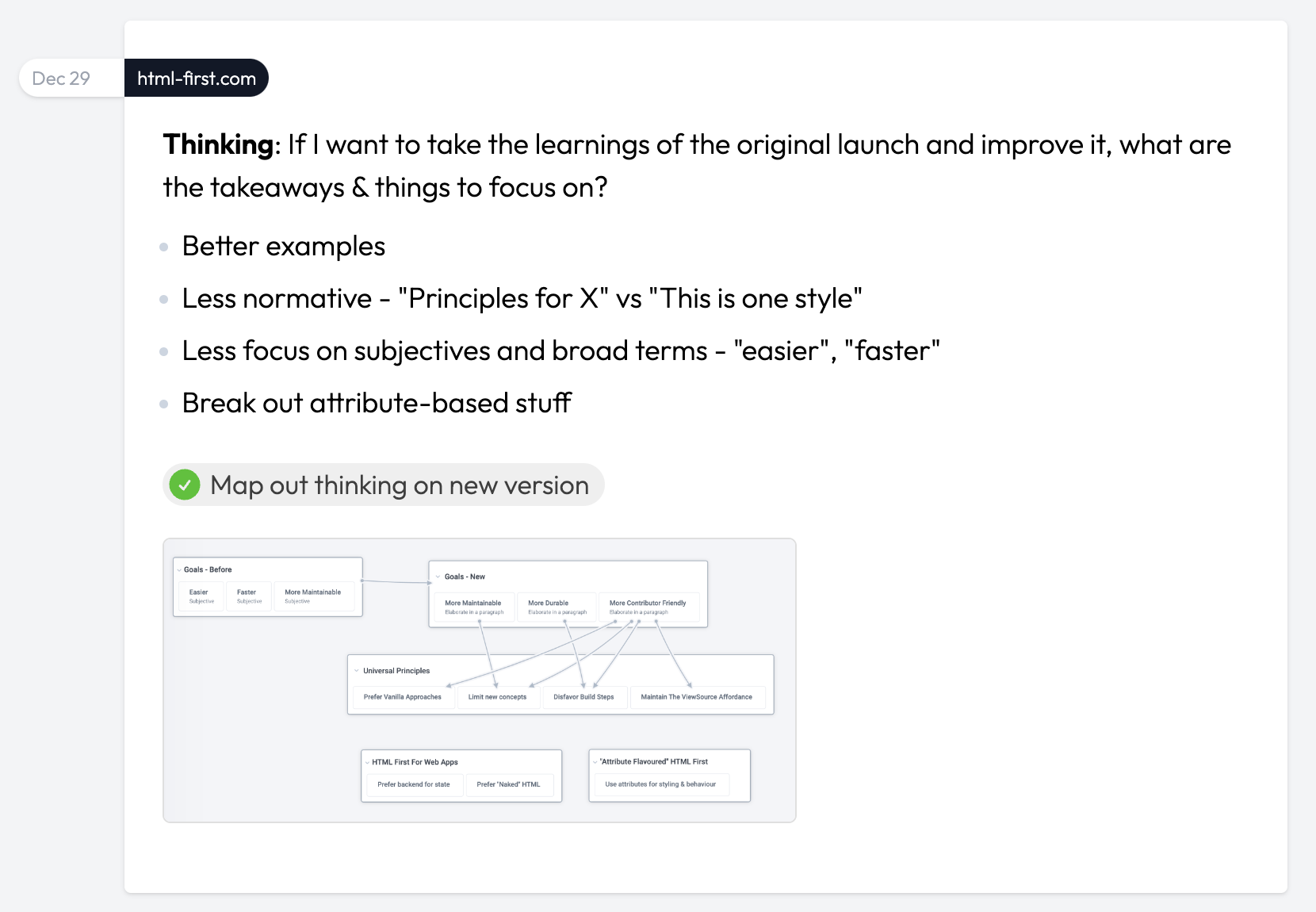
Thinking: I'm not liking the styling of the dates. The project isn't obvious enough and the left column feels like it needs too much space. It's also not super useful to see the month at the top because there tends to be quite a few posts for each month.
-
Design/code new style for date/project pills
-
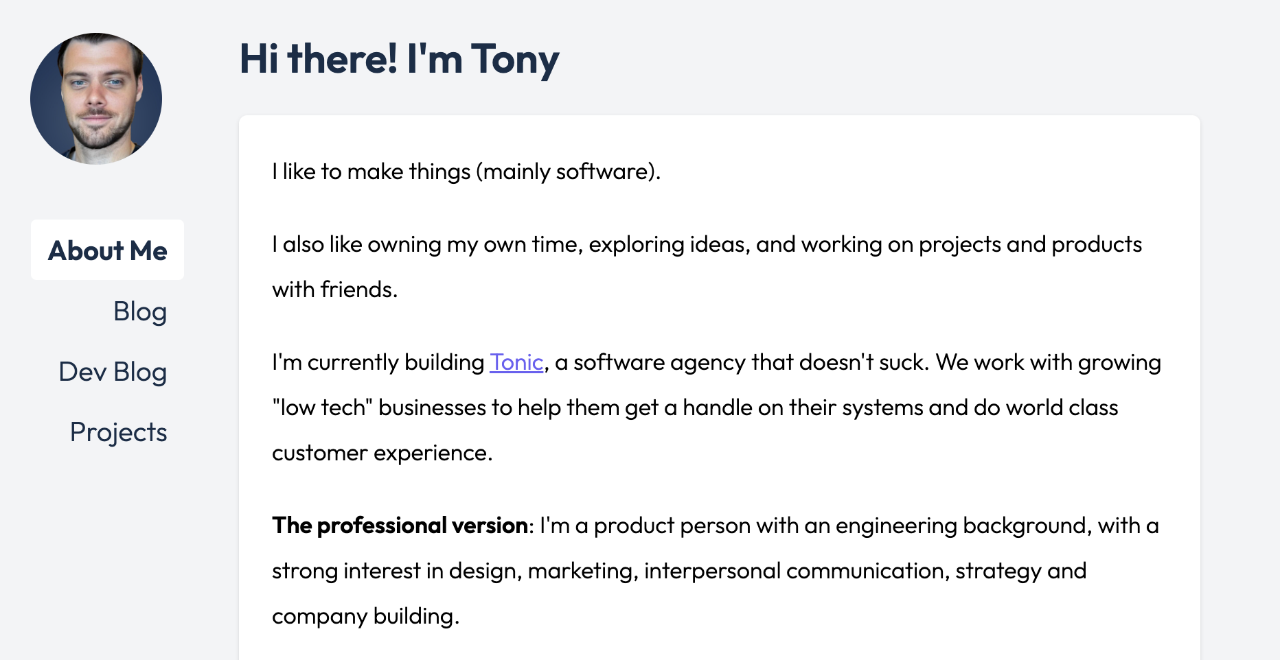
New Design 👇
-
-
Thinking: The font still irks me. Wonder how the one AJ likes (Jakarta) would look
-
Switch from Outfit font to Jakarta font
-
-
Before
-
-
After
-
-
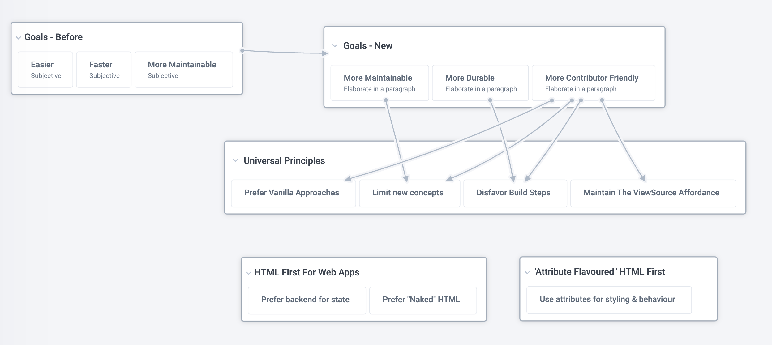
Thinking: If I want to take the learnings of the original launch and improve it, what are the takeaways & things to focus on?
-
Better examples
-
Less normative - "Principles for X" vs "This is one style"
-
Less focus on subjectives and broad terms - "easier", "faster"
-
Break out attribute-based stuff
-
-
Map out thinking on new version
-
-
Manas has the native apps re-compiled and working again, but needs the Apple/Google accounts to upload and publish them.
-
Get Apple creds to Manas
-
Figure out which Apple account to use - Using tony@toniclabs.ltd.
-
Figure out Google Play console account
-
Compile & share credentials
-
-
Create new account API & share with Manas
-
Create endpoint (route & controller)
-
Add validations & error messages
-
Push to prod
-
-
Get Atlas Expo codebase working locally
-
Swap in correct URLs for each tab
-
Add viewport meta tag to fix mobile display issues
-
-
Tasks
-
Add umami analytics
-
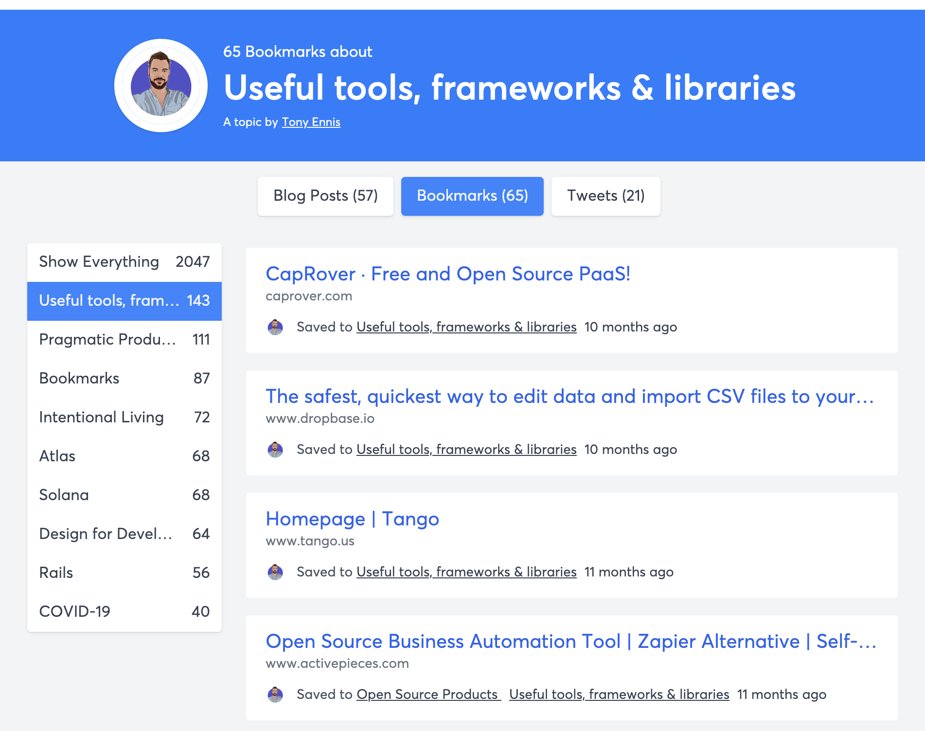
Code left-aligned topic menu
-
-
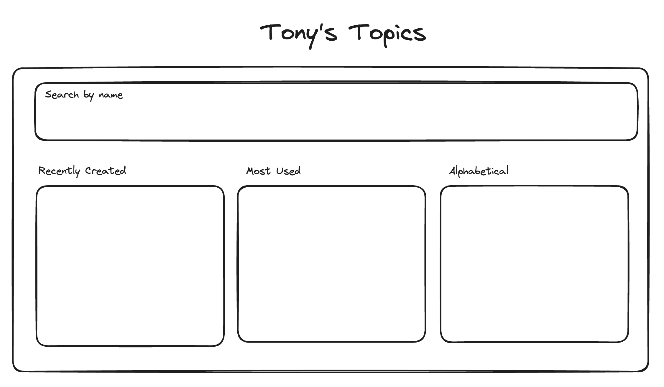
Thinking: The left-side menu is handy for quick browsing but I can imagine a bunch of scenarios where I want more fine grained control over browsing by topic. What might that look like?
-
Wireframe: Design for "Filter by Topic" modal
-
-
-
Tasks
-
Fix roam styling using :has to fix the odd alignment issue
-
-
Tasks
-
Message Steph Smith on twitter about using it
-
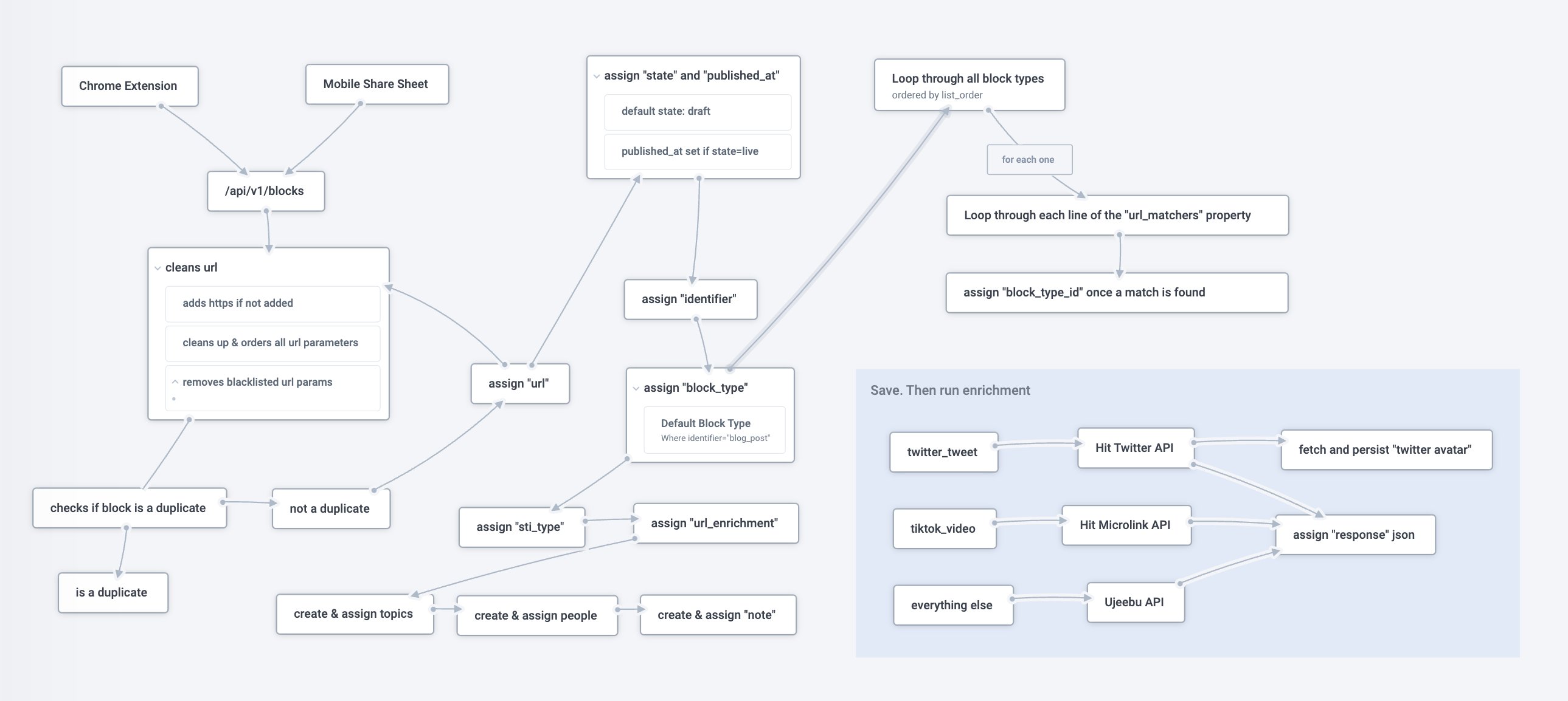
Document the ingestion flow - link
-
-
-
Tasks
-
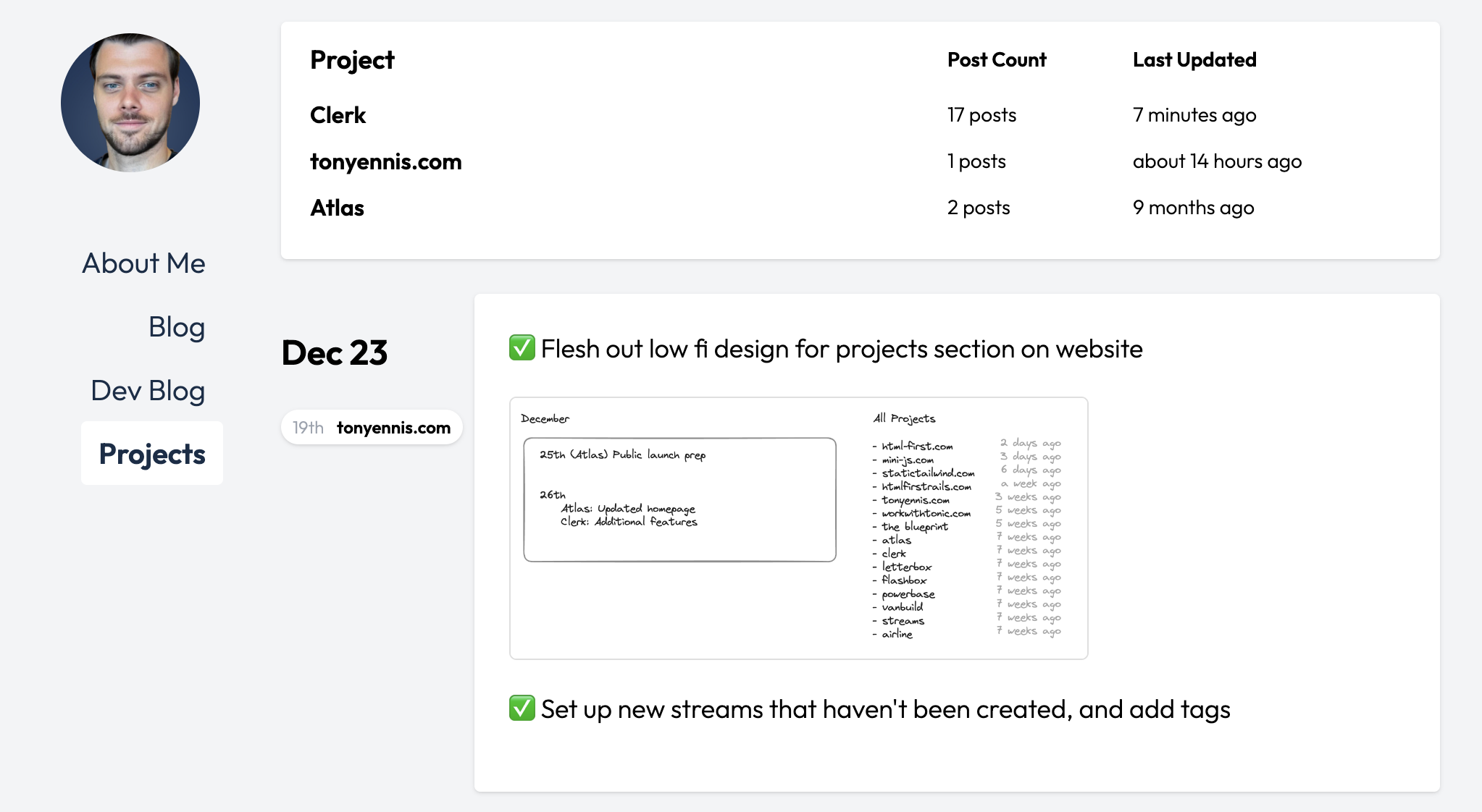
Flesh out low fi design for projects section on websites
-
-
Set up new streams that haven't been created, and add tags
-
Implement layout for new projects page based on wireframe
-
-
Not happy with the feel at the top of the page - the layout feels wrong. Will return to it and clean it up.
-
-
Tasks
-
Call with Manas about resurrecting the mobile apps again
-
Conclusion: Manas starting work on Monday to get the apps back in the app store
-
-
Thinking about Clerk - now that I've used it for a while. Some thoughts
-
The three biggest things that prevent me from using it more:
-
Not having regular reminders - email/home screen widget
-
Sync breaking, and there not being an easy, predictable way to fix it.
-
Not having categorization work on auto pilot.
-
-
Some other observations
-
It's too heavy of a lift to do the monthly reconciliation consistently and move money in/out of vaults etc. But if vaults aren't the right way, then how do I segment out those buckets and have the costs in them not effect my GFS?
-
Having an income target is probably unnecessary in most cases, because:
-
Most people have fixed income anyway
-
Missing this target will show up in the other targets
-
-
Having a "Fixed Costs" target also feels kind of silly, given they're meant to be fixed, but it's also not super easy to understand if/how they fluctuate over time - see next point.
-
I keep wanting to see how I've done as a trend over time (e.g last 6 months), but right now I can only track progress on a month to month basis.
-
It's not easy to see and keep track of temporary outgoings (loans/deposits). Likewise temporary incomings
-
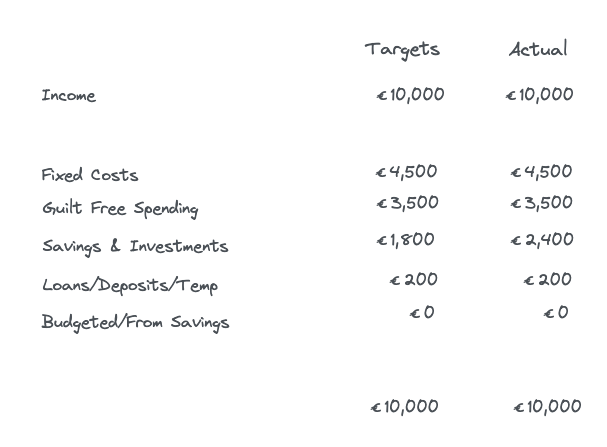
The new table-like target tracker has too much going on to feel useful on an ongoing basis.
-
The two questions I find myself repeatedly wanting to know are:
-
Am I on track to hit my targets with my current spending
-
Am I in danger of hitting zero before my next pay check
-
-
Both of these require some form of forecasting - having some idea when new costs will land.
-
-
Features
-
Add functioning "re-sync" button when a bank account sync is expiring.
-
Remind a user when sync is expiring in a month, have a one click link in the email (which bypasses login) to re-sync. Bump re-sync period up to 6 months.
-
OpenAI powered auto-categorization
-
Daily/weekly email with overview
-
Homescreen widget for iphone
-
Simpler target panels
-
Add ability to tag an incoming outgoing as temporary
-
-
Updates
-
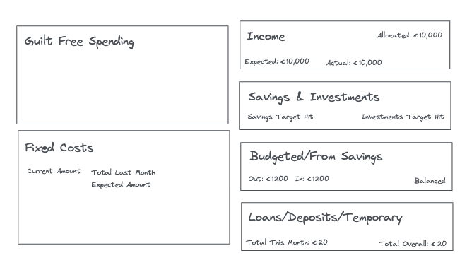
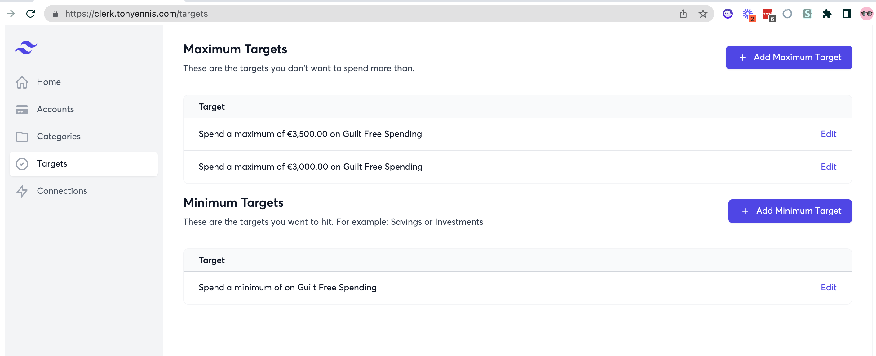
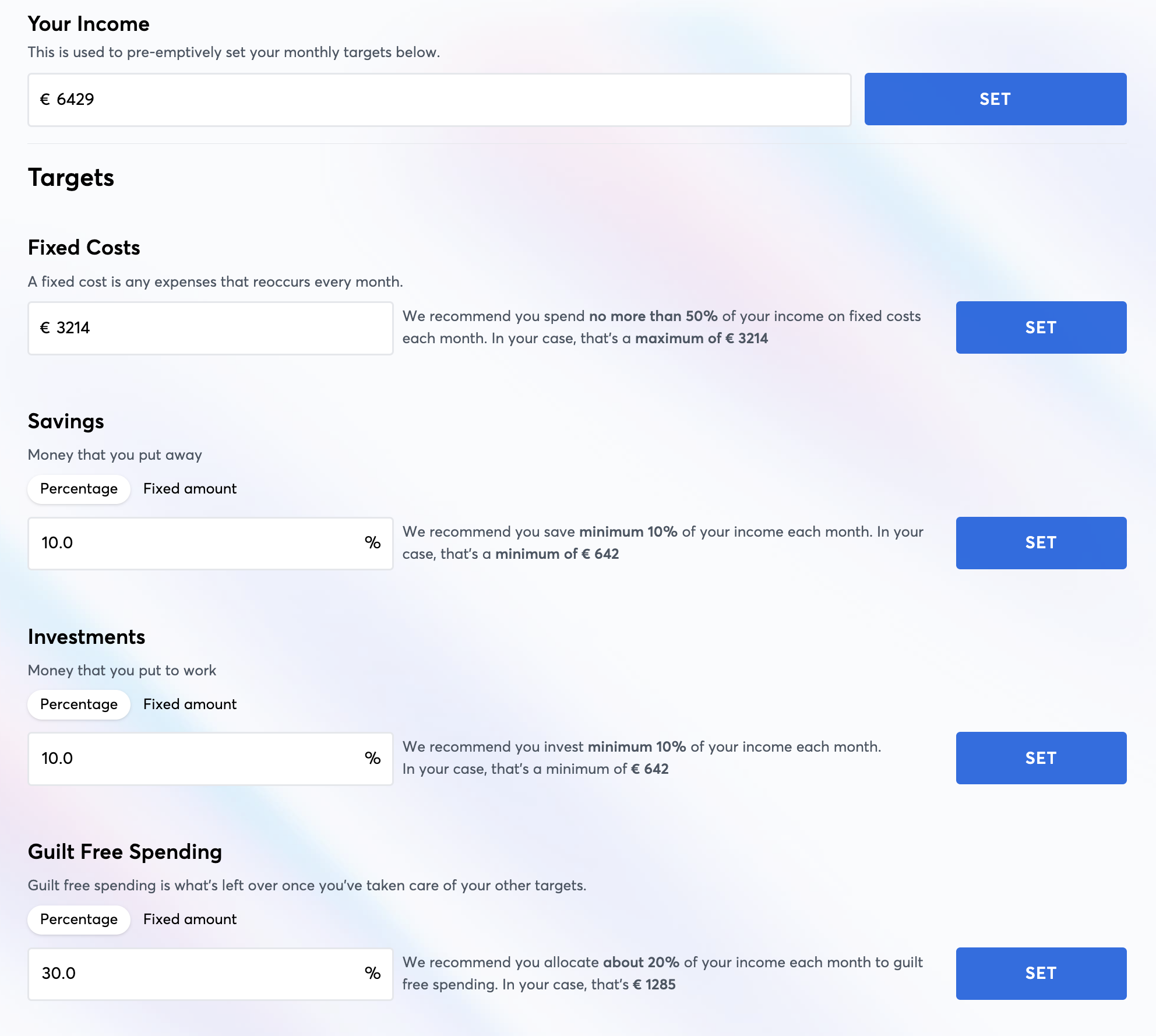
We now have 1. A new targets section on the month view, showing targets and actuals, 2. A new form for inputting targets, and 3. A new left navigation and new icons. I much prefer it this way but we'll see how the beta testers like it.
-

-
-

-
Tasks
-
Fix delayed jobs
-
Scheduled Daily task to refresh master Nordigen token (linking bank accounts breaks without this)
-
Update release note docs and publish
-
-
Tasks
-
Make Loom to ask David for feedback on direction for targets
-
Did a little bit of backlog clean-up earlier - realized there are quite a few open tasks, potential releases and directions to move in. My conclusion is that for now the smartest things to focus on are 1. Retention (ensuring the 3 people currently using it are set up to get the most out of and using it regularly), and 2. Activation (make it easier & smoother to on-board more people)
-
Tasks
-
V1 Metabase user dashboard
-
-
-
Bug: Editing categories & editing targets erroneously triggers a shimmer effect
-
David N onboarding
-
Had a great call with David - overall he gave Clerk a 9/10 despite some pretty gnarly bugs. He turned out to be an ideal person to onboard as he's been following a pretty similar system manually for the last few years.
-
Some takeaways and ideas:
-
Would love to have targets per category and/or for periods longer than a month.
-
Pricing: Would see it as being in the sub $10 range. Would pay for it (and I don't say that a lot)
-
(sometimes Nordigen can have an account classified as current that's actually savings.)
-
Bug: Editing categories & editing targets erroneously triggers a shimmer effect
-
Idea: Let me see a selection of my transactions as I'm creating new categories
-
On transaction edit form - two dropdowns show "Please select" but neither has a label
-
-
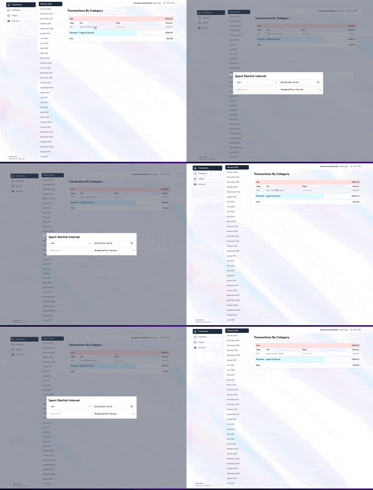
Create and implement new animated modals
-
-
Mock up new potential designs for "Target" panel, showing more info per pane
-
-
Implement beginnings of the instant-load effect for the middle scroller, to give the feeling of snappiness when a link is clicked
-
Play with design for new low-fidelity section
-
-
Write up "How Clerk Works"
-

-
Update: Onboarded our first beta user today (Megan). Had several learnings which I'll write up separately.
-
Tasks
-
Save and store additional information about accounts (account type, json_data)
-
Set bank account names based on the names returned by Nordigen (savings accounts now supported)
-
Auto fetch transactions when user first connects new account
-
Remove "Connections" menu item as Accounts does the same thing.
-
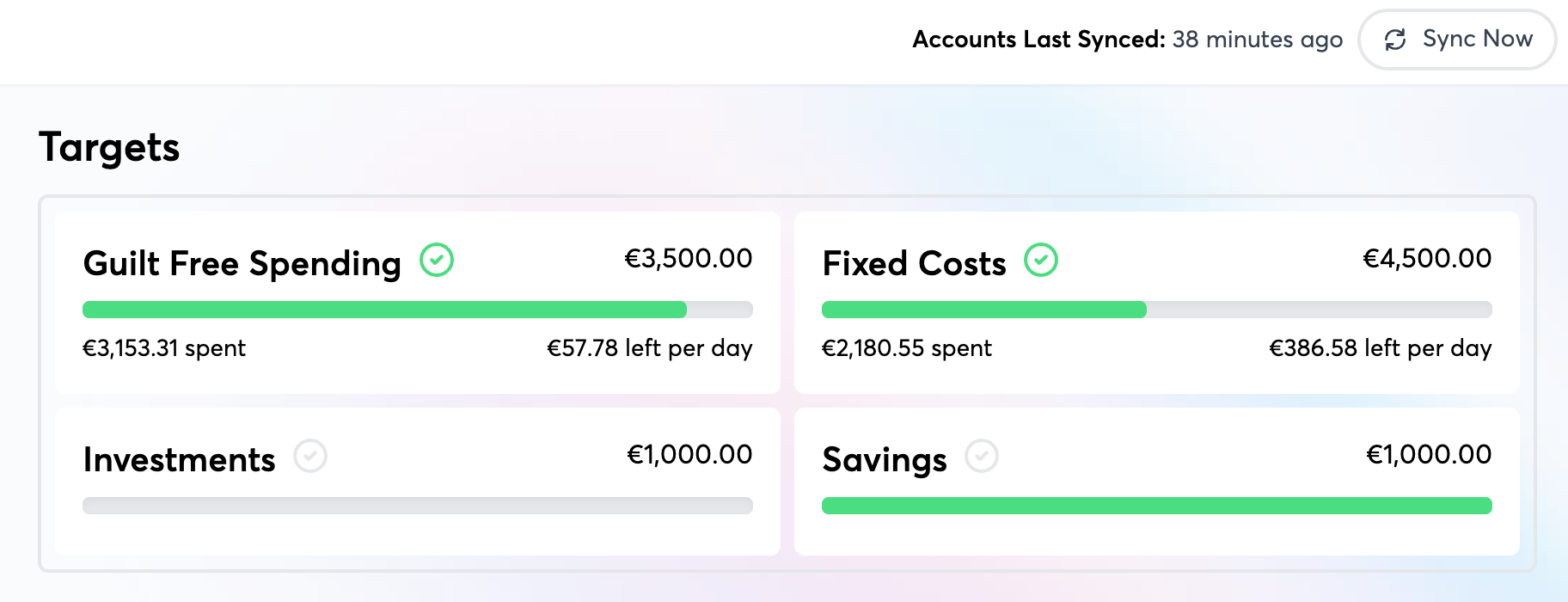
Improve display/behaviour of targets
-
-
Remove red/green borders on target panels
-
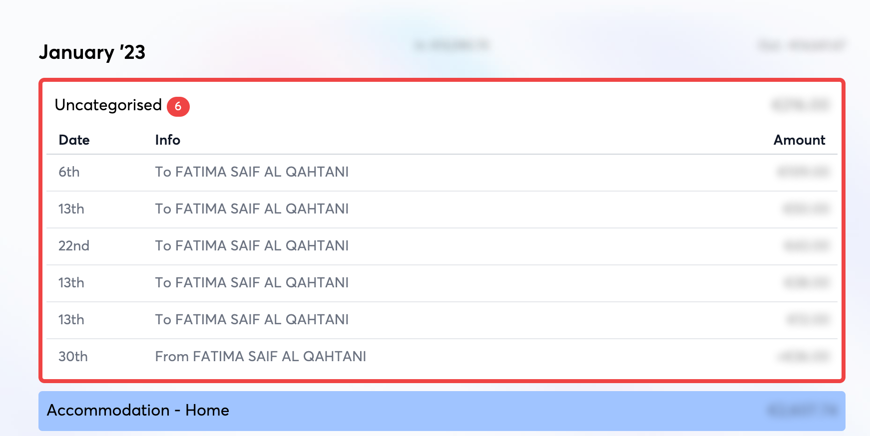
Remove red border on uncategorised
-
Show remaining per day
-
-
Click target panel to filter transactions, instead of collapsing inside a card
-
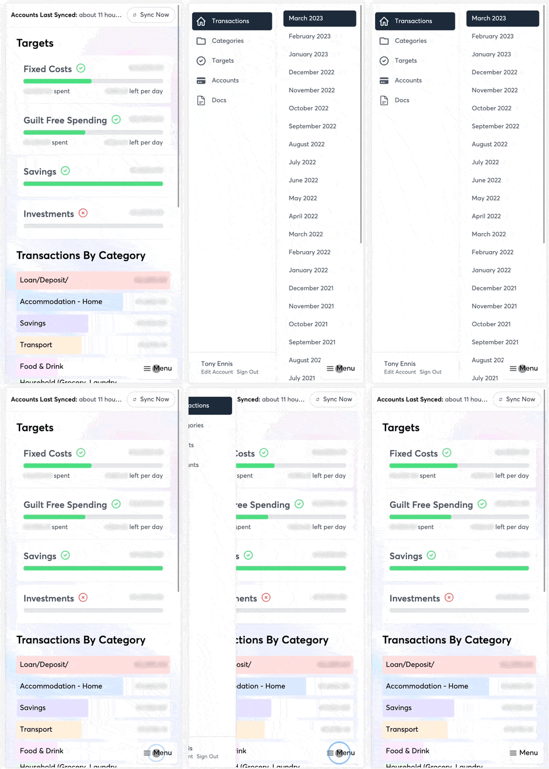
Get mobile looking/working reasonably well
-
Borders & padding
-
Add temporary bottom right menu button
-
-
-
Test out new subtle color background
-
Copied from tailwindcss.com. My first impression is that I quite like this. Will let it sit for a while
-
-
-
Add red border to uncategorized transactions to incentivise users to categorize
-
-
Add sync button to the transactions home
-
-
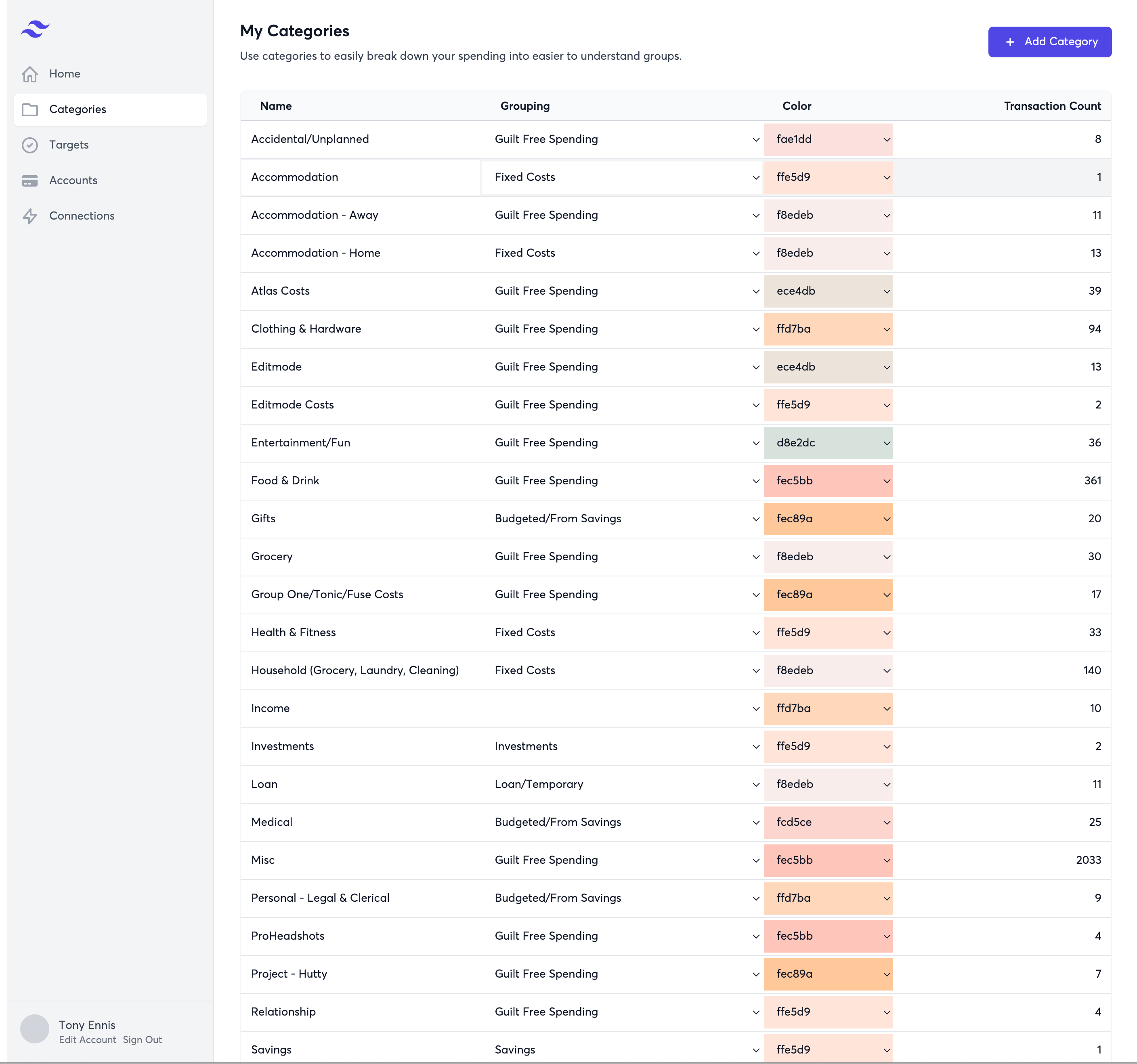
Clean/Organize categories section
-
-
Fix uncategorized reordering
-
Keep active section open after moving a transaction to another category
-
Implement new 2 panel tailwind layout with month grouping 😍
-
-
Add stylus blur styles to make it easier to take vids and screenshots
-
-
Set First month as active by default on home view
-
-
Made really great progress on the main overview screen on the plane home from Geneva.
-
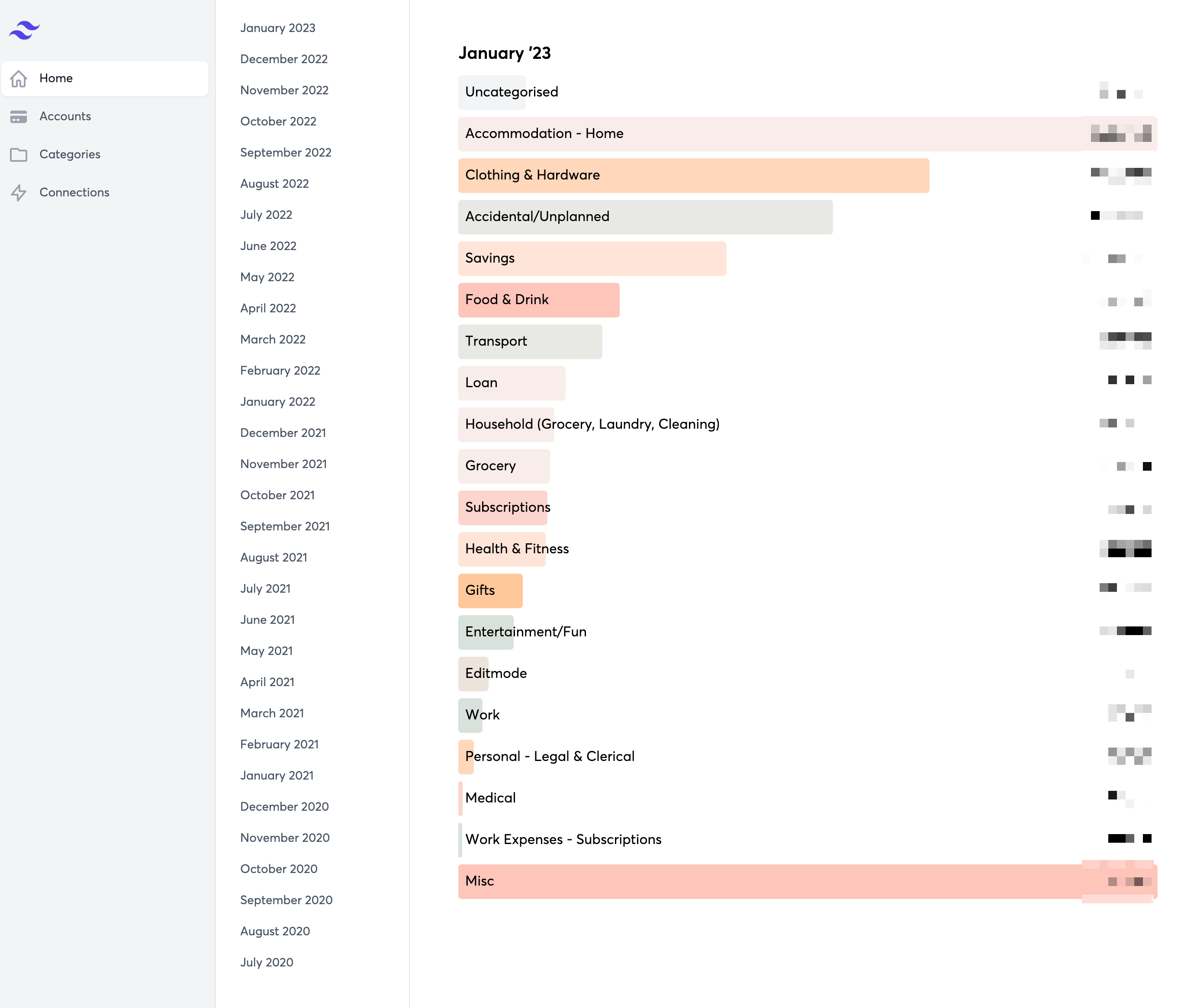
Monthly overview section
-
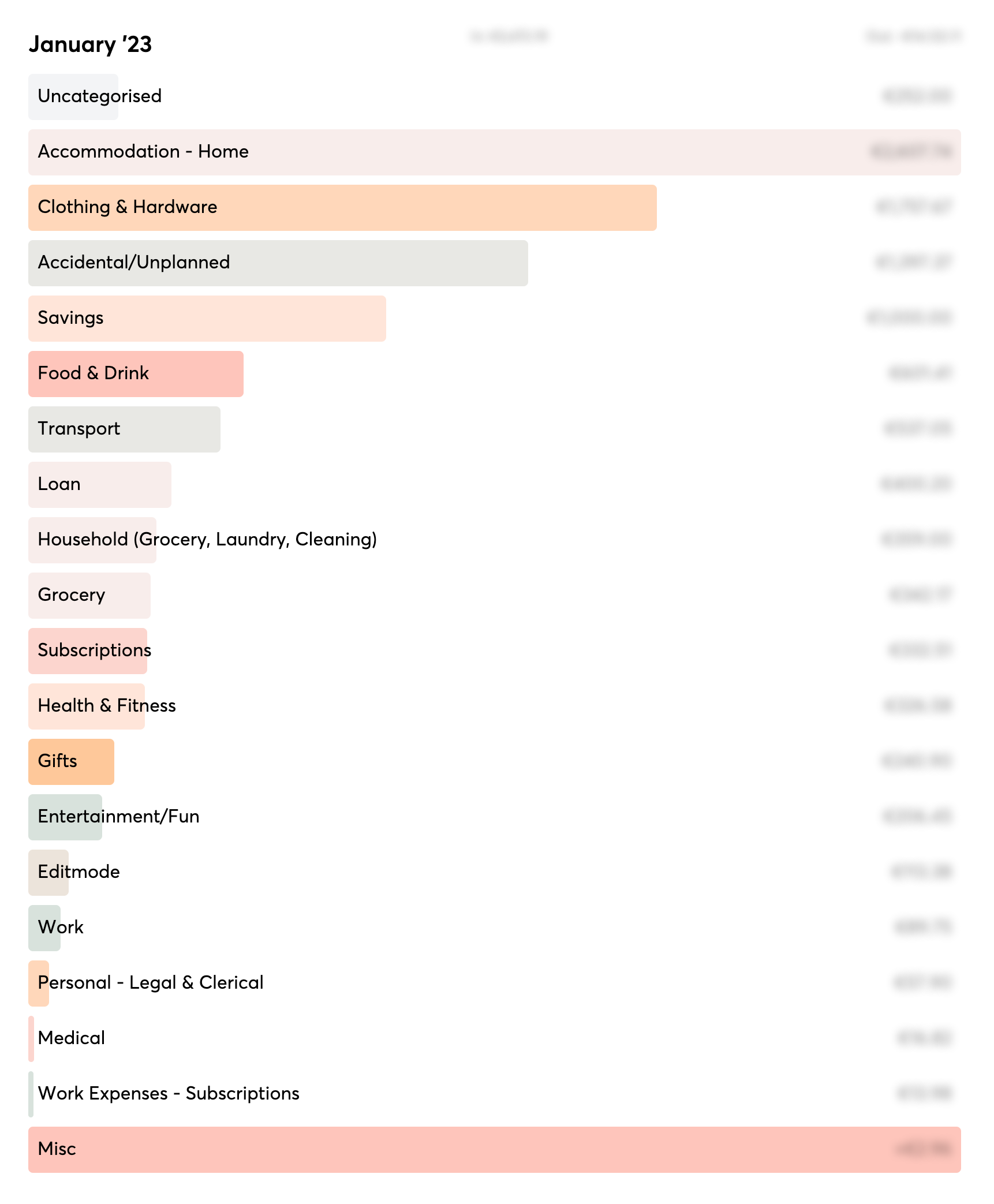
The monthly overview allows you to get a birds eye view of how you've spent money in the months gone by, and quickly categorize transactions on a per transaction or batch basis.
-
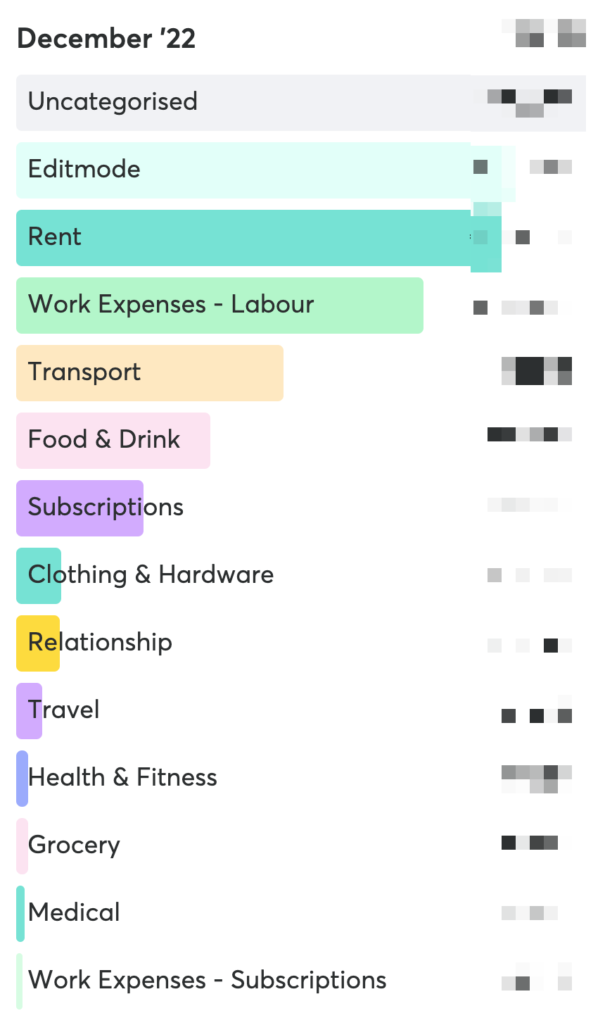
-
By default, your transactions are broken down by category. Transactions with no category will be shown as "Uncategorized".
-
Clicking on any of the bars reveals a list of the transactions for that category
-

-
By default, the "Uncategorized" section is ordered by the transaction name, and the other sections are ordered by the day of the month.
-
Fix Wise transaction enrichment bug
-
Enrich past wise transactions with no data
-
Start thinking about categorization
-
Best way to categorize for a period is likely:
-
Order by transaction name alphabetically (to group similar transactions)
-
Click and Drag to select a group
-
Once mouse is released, trigger input with autocomplete to apply category
-
-
Second option
-
Allow user to define buckets or categories up front.
-
Then use AI to auto categorise transactions, then give a UI to review and correct
-
-
-
Take a look at metrics
-
Look into Google search console issue
-
Previously submitted file still not fetched
-

-
Read Build & Submit a Sitemap to google
-
-
Create sitemap2.txt route in the app and push to production
-
Submit txt version and re-try
-
Still getting the same vague error
-

-
-
-
Get a url I can go direct to regularly
-
Can now go to clerk.tonyennis.com and see the dashboard page
-
-
